usability and information architect

Expert Review & usability audit

An 'Expert review' can be carried out on an existing website, a prototype, or wireframe designs. The review provides a 'heads-up' audit of usability issues with the site and recommendations for improvement.

Review Methods:

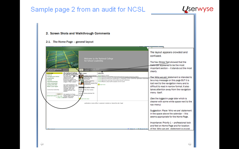
The methodology we use is known as 'Expert walk-through' of the pages, based on one or more typical user tasks, noting strengths, weaknesses and any issues that are likely to cause problems, with recommendations for improvement. To get some background we'll need to discuss your audience profile and what tasks are most important to them and your business.

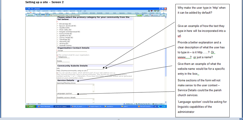
Here are just a few examples of UX review projects we have carried out. Some of these were followed up with usabiliy testing after redesign.

Expert review of wireframes for Berghaus retail site

Expert review of a wireframe
Expert review report showing annotated wireframe

We reviewed a set of over 40 wireframes for Berghaus's retail site, one of several reviews we have carried out for our associates bit10

Recommendations included:

  • Use larger fonts on the Home page sub-menus
  • Use alphabetical order within category sub-menus for products - will make it easier for users to find things
  • Elevate Customer Service and Buying Guide to top right navigation
  • Labelling inconsistencies found with the 'basket' and the 'mini-basket' and 'bag' which would confuse users
  • Numerous other improvements suggested to labelling and headings

(Undertaken and managed by bit10)

Expert review of a site in the Telecomms sector.

Telecomms comparison site 1
Telecomms comparison site 2

Janet reviewed an early development version of this site in the Telecomms sector

Positive findings:

  • Colour combination works well and conveys a 'trusted' business feel
  • High quality graphics create a good first impression
  • Quick Comparison module should draw users into the site, however it may be overlooked because of its position on the screen
    Areas to improve:

  • The home page does not immediately communicate what the business is about
  • The tab navigation is poorly structured
  • The Quick Comparison module is positioned in a location where it is unlikely to be noticed
  • Layout of items and navigation structure will probably lead to users 'dropping out' of the home page because they cannot work out what to do
    Key recommendations:

  • Re-position the Quick Comparison module to the left of the main image (where it is sure to be noticed)
  • Group tabs in a logical layout with related tasks together
  • Place all the information tabs together as related activities Advice / Help / Online chat
  • Amalgamate 'Find the best deal' and 'Compare deals' into one 'Compare deals' tab
  • Put 'Basket' in a more conventional location in the header area

(Undertaken and managed by bit10)

Cheapflights: Using expert walkthrough for competitive evaluation

Travel site Home Page
Comparing five travel sites

Cheapflights is a price comparison site in the travel industry. After completing several usability testing studies, we used 'personas' and scenarios to structure a 'walkthrough' to carry out competitive evaluation against other sites.

Our reports enabled clients to move forward with increased knowledge about user needs and behaviour on travel sites.

Activities included:

  • Competitive Evaluation
  • Personas and Scenarios

(Carried out directly for Cheapflights)

NCSL: Review of pages for National College online learning portal

Review of the NCSL learning portal
page from the portal review

Janet carried out an expert walkthrough of early prototype pages for the NCSL Learning Gateway, a portal for teaching staff.

A 'Navigation stress' review was completed, plus a walkthrough using a usability heuristics scoring system.

Findings included:

  • Home page layout was crowded and confusing
  • Navigation from the Home page was likely to be confusing for users
  • The news area was useful but likely to cause further confusion
  • The login area was hard to find
  • colour coded pages were not ideal for colour blnd users
  • Headings were coded as images - a bad idea for accessibility

(Undertaken and managed by bit10)

Kingston Council: Review of preliminary website designs

Kingston Council review of a form page
Review of a form filling page

In this project for Kingston Council, Janet reviewed preliminary designs for a website builder. This was a tool for the general public to create their own community websites. Our report, with illustrations, recommended improvements to the site to improve usability and take-up.

Recommendations included:

  • Provide more help to users through better labelling
  • Pointed out where errors were likely and how to prevent them
  • Suggested online help and prompts to help the user

(Undertaken and managed by bit10)